The most distinguished artist connected with surrealism is surely Salvador Dali, yet in my opinion far more interesting paintings were created by Rene Magritte. He was humble and elegant, surely not as attention-seeking as eccentric Dali. In his paintings we can see mysterious characters next to strange objects or imaginary backgrounds. Magritte was a very precise, realistic even, painter, but the themes of his paintings are completely surreal – as if from a dream.
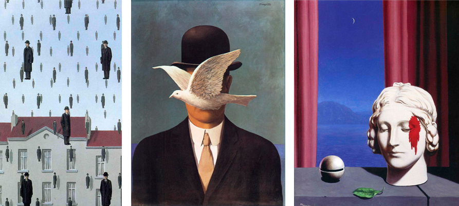
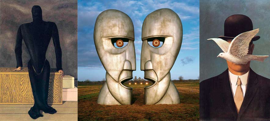
What’s fascinating is that after viewing a number of Magritte’s paintings, it becomes clear that he used over and over the same motifs, only in different configurations. Most recurrent themes in his works are: men in black bowler hats, apples, spheres, red curtains and clear sky with white clouds. Some could say that the pieces are very optimistic – nothing further from the truth. Magritte’s paintings inspire uneasiness and are loaded with pessimism. His characters with covered faces aren’t just a simple trick to make a painting more interesting. This motif has its origin in a nightmare from Magritte’s childhood. His mother committed suicide by drowning in a nearby river. Little Magritte saw her body pulled out of the water, as her head was covered with a piece of cloth. The image was burned into artist’s memory for the rest of his life and he very often returned to this theme. An example can be seen below – Magritte’s most famous work ‘The Lovers’:

Rene Magritte had a huge influence on other artists – those associated with pop-art, neosurrealism, computer games designers too. Even films by David Lynch were somehow inspired. Notice that in almost every production of this famous director there are red curtains – a motif taken directly from Magritte’s pieces.
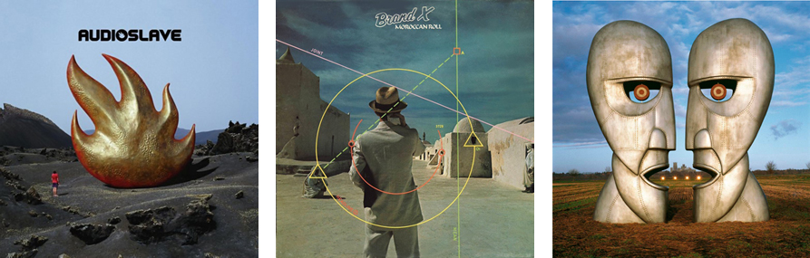
For me, one of most interesting examples of being inspired by Magritte is Hipgnosis – a group of graphic designers specialized in album covers, based in Great Britain at the end of the 60s by Storm Thorgerson and Aubrey Powell. Their studio became famous in 1973 thanks to the cover to Pink Floyd’s ‘Dark Side of the Moon’ (below).
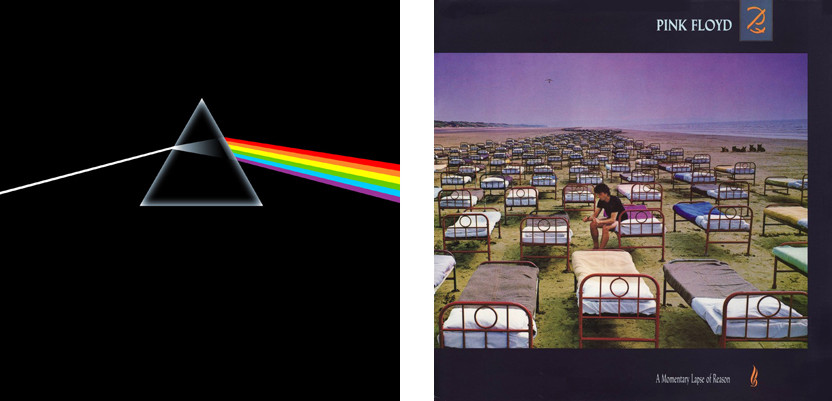
The cover features a prism through which goes a beam of light and splits into a rainbow. The opaque, triangle-shaped prism represents the crystal clear sound of Pink Floyd’s music. The rainbow stands for richness, the sound spectrum and colourful light effects present during Floyd’s concerts.
At first the record company didn’t want to agree to this version of the cover, arguing that it won’t sell a cover devoided of the title and group’s name. Fortunately, guys from Hipgnosis were friends with the members of Pink Floyd, and the group posed an ultimatum: either this cover, or none. The company stepped down and Dark Side of the Moon turned out to be a great commercial success. 50 millions of copies were sold and it’s the second best-selling album in the history of music.
After that, Hipgnosis was flooded with commissions for covers. They worked with many famous rock bands such as AD/DC, Led Zeppelin, Genesis, Yes, The Alan Parsons Project, Black Sabbath…..And of course they continued to work with Pink Floyd. Their projects, just like Magritte’s paintings, have this amazing, surrealistic touch, well thought out ideas and great realization. And how did the projects come to life? At first glance they look like perfect photomontages, but they didn’t have Photoshop in the 70s. The genius of these covers lies in the fact that they are real photos, often executed with tremendous amount of work. On the cover for ‘A Momentary Lapse Of Reason’ (above, on the right) there is over a hundred beds, which were in fact brought to the beach; All that was left then was waiting for the right weather to take the photo. Notice the hang-glider in the sky – it refers to one of the titles on the album, ‘Learning to Fly’.
There are numerous meaningful details and symbols such as these in Hipgnosis projects, they are fascinating and there is no way to describe them all here. I encourage you to check out more of their covers. You can easily notice that just like in Magritte’s paintings, Hipgnosis cover art also features the same elements over and over again, in different contexts: spheres, mirror reflections, glass, blue sky or water, beds in outdoor setting, triangular compositions, changing the scale of objects. And one more similarity – when you look both at Magritte’s and Hipgnosis art, it falls in memory forever.