
Green Book is slowly emerging as one of the big villains of Oscar season. Second only to the unimpeachable cruddiness of Bohemian Rhapsody, Green Book has been lambasted for applying a white perspective to a black issue, for misrepresentating its lead character, for the writer’s Islamophobic tweet, its director’s historical penchant for sexual misconduct and the star’s willingness to say the N-word in public. Green Book is, at this point, completely unlovable. Only a miracle could restore its reputation.
But what’s this galloping in from the horizon? A charmingly terrible poster being used to advertise the film in the Philippines? A poster so classically, catastrophically inept that it somehow orbits out past “awful” and all the way back to “incredible”? A poster that contains, for all the world, two separate instances of actual clip art where a smiling white man stands arm-in-arm with a smiling black man?
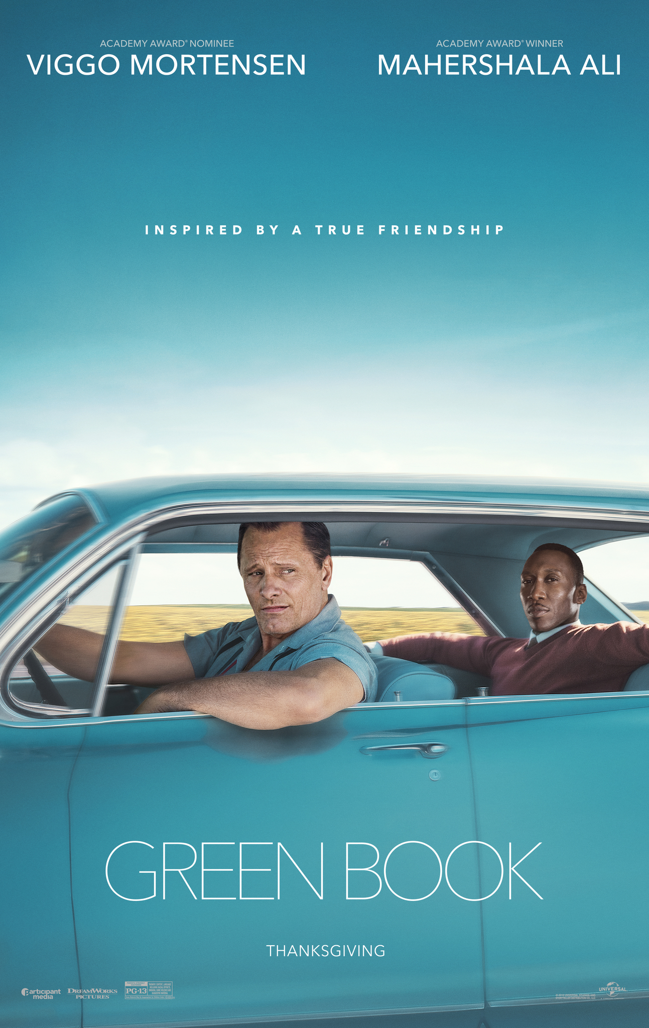
It is. And it’s glorious. Compare this poster with the original Green Book poster, which is a by-the-numbers study in dreariness, a groaning caricature of take-me-seriously Oscar bait. The graphics are spare. The fonts are tasteful. The tagline – “Inspired by a true friendship” – contains enough worthy sap to make you bilious. Everything about the poster says: “I’ll add this to my Netflix list 18 months from now but never get around to watching it.”

The Filipino version, on the other hand, is a masterpiece. The font gives the impression of a zany comedy, but the clip art cartoon of police officers in the top corner adds an element of danger. The actors still look moodily inscrutable, but this is offset by the clip art cartoon of a man playing the piano. And the sombre wilderness of old? Forget it: now they’re sitting in a car in the middle of the city, baby! It all looks like so much fun. No wonder the cartoon men that have been slapped around the edges are smiling so broadly. This film looks like a blast!
There’s probably a sensible explanation for the weirdness of the Filipino poster. Perhaps it’s a cultural issue. Perhaps it’s down to the local distributor, which is notorious for its awful posters (see its poster for The Upside, which screams “#1 MOVIE IN AMERICA, DEFEATING AQUAMAN”. But that’s by the by – I would much rather see this film than the one advertised by the original poster. That one is flaccid; this one is joyous.
Perhaps this is the future of movie posters. Look at the rest of this year’s Oscar crop. Would you go and watch The Wife? Really? But what if its poster was covered in pasted-in graphics? What if Glenn Close’s face was replaced by a giant depiction of the one-eyed tongue-out emoji? What if the title was printed in comic sans? What if its tagline was changed to “Oh boy, this is one crazy wife!”? Tell me you wouldn’t watch that. Of course you would.
In the meantime, it’s not too late for Green Book. The Oscars are still some way off, and this poster gives its campaign something to lean in to. Universal should run across-the-board “For your consideration” adverts using the Filipino version. Viggo Mortensen and Mahershala Ali should pose for a new series of Microsoft Word clip art images. I can’t believe I’m the first person to think of this. The statuette is back in your grasp, Green Book. Don’t blow this chance.